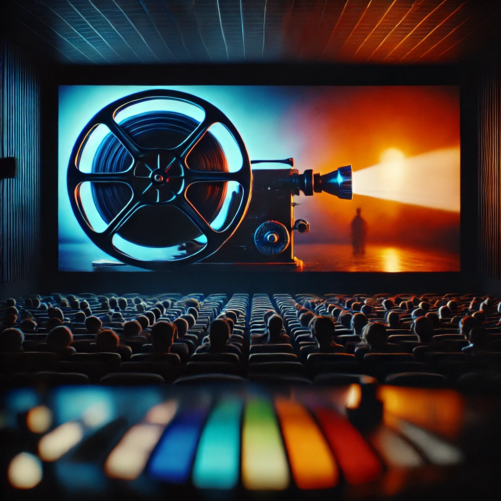
Color is a vital yet often overlooked element in filmmaking, playing a significant role in how audiences perceive and emotionally engage with a story. It can evoke feelings, define character arcs, and even guide the viewer’s attention to key details. Directors and cinematographers use color theory—a framework that explains the relationship between colors—to create emotional depth, symbolism, and visual contrast.
In this article, we’ll explore how filmmakers use color to amplify the impact of their stories, with real-world examples of how color theory is applied for maximum effect.
Understanding Color Theory in Film
At its core, color theory involves the combination and use of primary, secondary, and complementary colors to achieve harmony and contrast. Filmmakers leverage this theory to create a deliberate visual language that enhances the storytelling experience.
- Primary Colors: Red, blue, and yellow are foundational colors that can be combined to form all other hues. In film, these colors often serve as symbolic anchors—red for passion or danger, blue for calm or melancholy, and yellow for energy or caution.
- Complementary Colors: Colors opposite each other on the color wheel (like blue and orange) create high contrast and tension when placed together. This contrast is widely used in films to create visually striking compositions, such as in Mad Max: Fury Road (2015), where the dusty orange desert is contrasted with the cool, blue-tinted skies.
Emotional Impact of Color
Each color carries emotional weight. When used thoughtfully, color can instantly communicate mood or foreshadow events.
- Red: Often associated with love, danger, or violence, red can elicit intense emotions. Think of the use of red in American Beauty (1999), where it symbolizes both beauty and destructive desire.
- Blue: Frequently used to evoke calmness, isolation, or sadness. In Moonlight (2016), varying shades of blue dominate the film, representing both serenity and the emotional struggles of the protagonist.
- Yellow: A versatile color, yellow can represent both joy and caution. In Her (2013), yellow tones are used to convey the warm, nostalgic future where technology and emotions intersect.
- Green: Often associated with nature, growth, or envy. In The Great Gatsby (2013), the green light across the water symbolizes both hope and unattainable dreams.
- Purple: Signifying luxury or mystery, purple is less commonly used but powerful in evoking a sense of the surreal or otherworldly. The purple lighting in Black Panther (2018) enhances the futuristic, almost mythical quality of Wakanda.
Symbolism and Color Palette Choices
Beyond individual colors, filmmakers use specific color palettes to reinforce themes, symbolism, and character development. A consistent use of certain hues throughout a film can subtly guide the audience’s perception of the story.
- Monochromatic Palettes: Using various shades of a single color can amplify a particular mood. For instance, the all-blue palette in Drive (2011) emphasizes the cool detachment of the main character’s psyche.
- Analogous Palettes: Colors that sit next to each other on the color wheel (e.g., red, orange, and yellow) provide a sense of harmony. This approach is often used in films with warm, nostalgic tones, like The Royal Tenenbaums (2001).
- Triadic Palettes: Using three evenly spaced colors on the color wheel creates vibrant contrast without overwhelming the viewer. In La La Land (2016), the combination of red, blue, and yellow costumes creates visual excitement and reinforces the film’s themes of passion, creativity, and dreams.
Enhancing Storytelling through Color
Color doesn’t just enhance a film’s aesthetic; it becomes an active participant in the storytelling process. Directors can use color to signify a character’s journey, mark turning points in the plot, or provide subtle foreshadowing.
For example, in The Matrix (1999), the use of green tints inside the virtual reality world signifies its artificiality, while the real world is depicted in natural, desaturated tones. This contrast visually distinguishes the two realities without needing explicit explanation.
In Schindler’s List (1993), the film’s mostly black-and-white aesthetic is broken by the appearance of a girl in a red coat. This striking use of color draws attention to her in a way that signifies innocence amidst the horror of the Holocaust, making the audience emotionally connected to her fate.
Color is an incredibly powerful tool in filmmaking, one that can elevate the storytelling, evoke emotions, and create lasting visual impact. By understanding and applying color theory, filmmakers craft scenes that are not only visually stunning but also deeply resonant with audiences.
Whether it’s the vibrant, saturated tones of a Wes Anderson film or the subtle, mood-defining hues in a David Fincher thriller, the strategic use of color remains an essential element of cinematic language. Understanding how color works in film can lead to a richer appreciation of the movies we watch and the stories they tell.


